Ice cream meets activism.
In collaboration with Ben & Jerry’s, we embarked on a comprehensive overhaul, addressing information architecture, content strategy, and the development of a scalable design system tailored for a mobile-first approach across the customer journey.
For decades, Ben & Jerry’s has set the bar for what an activist brand can achieve, but their website was lagging behind the times. The disarray of disparate components and pages, coupled with disjointed navigation and search structures, impeded even the simplest tasks for fans.
Recognizing the need for change, they sought a partner to envision and design a new online destination that would breathe life into their brand and values, fostering both purchases and engagement. Our efforts resulted in a modern interpretation of an iconic brand that invests as much in its values as it does in the creation of cult-classic ice creams and treats.

My Role
Experience designer
Methodologies & Activities
Competitive/comparative research, experience audit, qualitative interviews
The team
2 experience designers
2 software engineers
1 product manager
Deliverables
User research insights report, content strategy, information architecture, digital design system, wireframe templates
Project Plan
Immersion & discovery | Weeks 0 – 4
Foundations based on brand ambition.
To kick off the engagement, we immersed ourselves in Ben & Jerry’s brand and business. While Ben & Jerry’s is setting new standards for what an activist brand can be, their website was stuck in the past and had become a disorganized mess of different components and pages with disjointed navigation and search structures making simple tasks difficult for fans. Working with key stakeholders, we aligned on project goals, audited the existing website, analyzed the sites performance, created a new information architecture, and crafted a content strategy for the new website. Our strategy focused on reframing the site as a platform that facilitates fans with seamless paths to purchase products or to join Ben & Jerry’s social mission by participating in causes their care about.
Takeaways from our experience audit

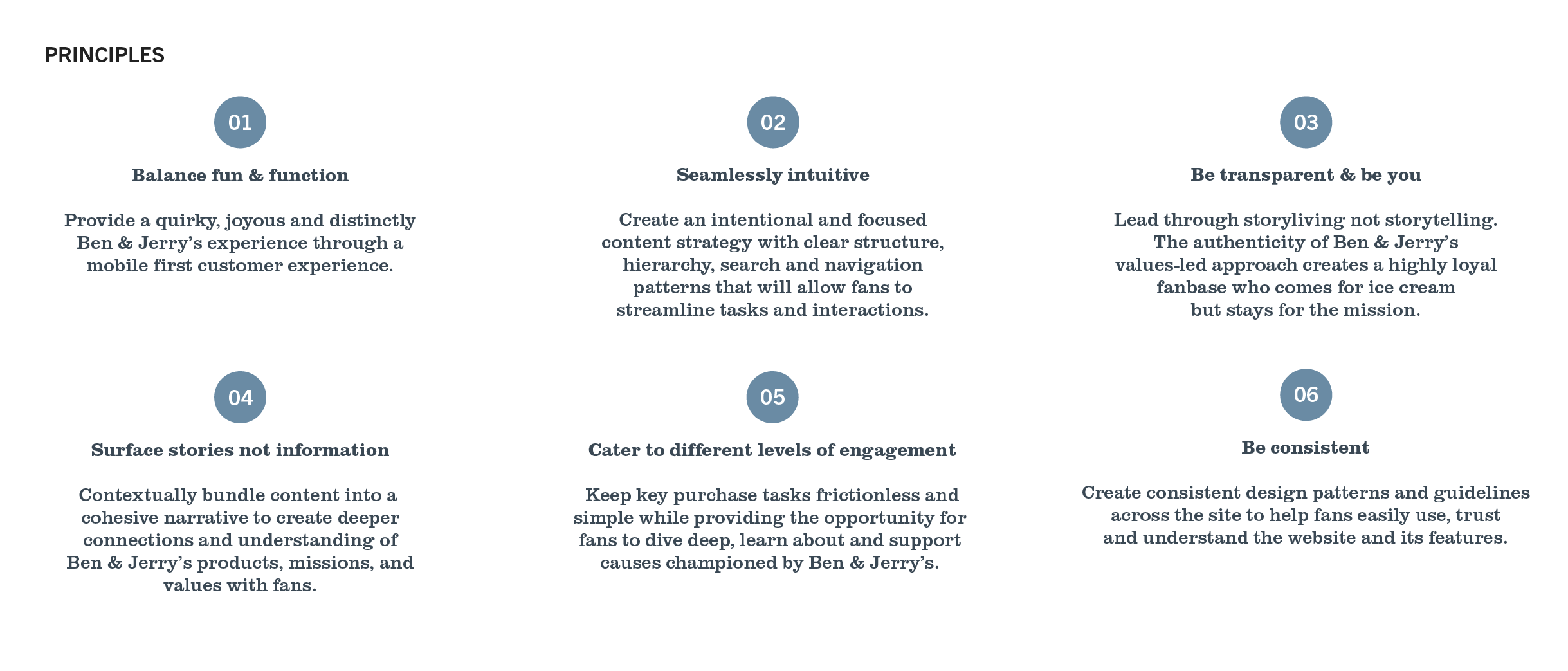
Based on our research and collaboration sessions stakeholders, we identified six experience principles that shaped the way we looked at the site redesign. They helped articulate the fundamental goals that design and product decisions can be measured against.
Experience Principles
Site foundation & Design exploration | Weeks 5 –11
Bringing the concept to life.
Building off of our new information architecture and content strategy, we utilized key elements of Ben & Jerry’s brand language to create a modern mobile first approach to the new site.
Our goal was to balance fun and function while making sure to cater to different levels of engagement and goals that fans would come to the site to accomplish.
We convinced our stakeholders to move away from one off pages and components and showed them how a concise and curated system could flex and scale to their many markets while still maintaining the joy and fun that is Ben & Jerry’s brand.
Visual evolution & component library.
The newly introduced information architecture and visual system makes the content-rich site easy to navigate and take quick actions or deeper dives based on a fan’s interest. Type optimizations increase readability on mobile as well as accessibility. Mixed media illustrations and new accent colors create a playful nod to the brand without sacrificng functionality.
In addition to a set of key templates, the team also created a component library with embedded rules for all of the major and minor components Ben & Jerry’s would need across hundreds of pages in multiple markets. This library provides a single source of truth for Ben & Jerry’s designers and developers, making it more efficient to create new designs that are consistent and responsive.
Sample design kit & screens


